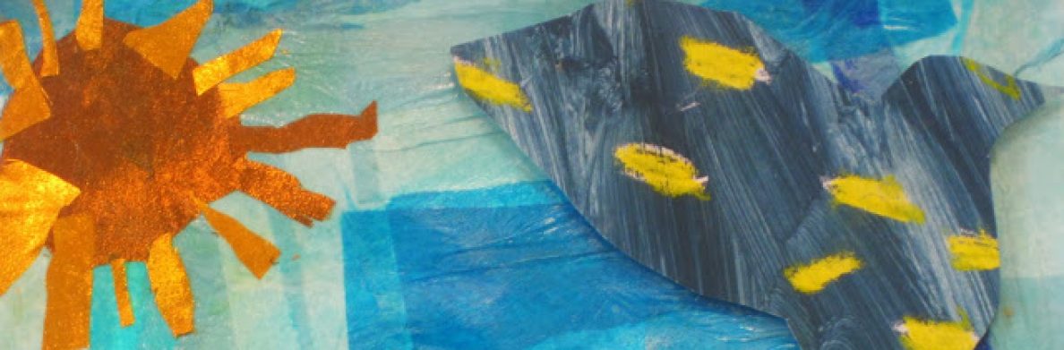
Featured Project September: Color Wheel Umbrella

September is great month for a simple project to get students talking about some basic elements of art – like color.
Supplies:
Sturdy white paper, pencils, black sharpies, oil pastels, charcoal crayons or sticks, paper towels or smug sticks.
Process:
- Introduce the color wheel and principles of color. Discuss how color effects mood or creates feeling in art and in the world.
- Have students trace circles for umbrellas and then divide into 6 (or more!) equal sections. Trace with black sharpie.
- Use oil pastels inspired by the color wheel to show primary and secondary colors.
- Use a pencil to draw the horizon line and then add legs and boots. Trace with sharpie and color with oil pastels.
- Use charcoal to create contrast and drama to background. Students can experiment with shading and smudging for desired effect.
Adapting for K and first grade: Young artists may have more success with a pre-drawn umbrella.
Additional enrichment for 4th and 5th Graders: The first color wheel was created by Sir Isaac Newton as he studied he light. Explore why.
When introducing color to young students you may want to discuss some of the following:
The Color Wheel:

A map that shows the relationship between colors.
Primary Colors:
The three primary colors create the base for all other colors. They can not be mixed from any other colors. Traditionally they are taught to be red, yellow and blue. However, this one can get tricky as there is come controversy in the art world as to what the “true” primary colors are. Many art teachers (such as my daughters at Jason Lee Middle school) teach the primary colors to be cyan, magenta and yellow. Here is a quick read as to why:http://www.anglowebs.com/courses/whataretheprimaries.htm. I’ll let you decide how to teach this one….
Secondary Colors:
Formed by mixing 2 primary colors.
Complimentary Colors:
On opposite sides of the color wheel. Are in stark contrast to one another.
Analogous Colors:
Lie on either side of a color on the color wheel. Can often be found together in nature.
Warm Colors: Colors such as red, orange and yellow. Used to suggest the feeling or quality of heat or sunlight.
Cool Colors: Colors such as blue, green and light purple make us feel calm and soothe. They may also make us think of water or sky.
There are a lot of resources online to help you get versed on the basics of using color and the color wheel in art. Here are a a couple if you’d like to go more in depth:
http://www.wiu.edu/users/sew100/itt351Project/ColorWarmCool.html
http://www.first-school.ws/t/apcolorarc.html
Have a great month in art!
